
Introduction
Mobile apps often use bottom navigation. You can reach all entries with one hand and it’s the same for Android and iOS. For Flutter apps, there is the widget BottomNavigationBar to accomplish this. In this article, I’ll share how to use BottomNavigationBar in Flutter apps.
We start with this standard implementation:
class MyApp extends StatelessWidget {
  const MyApp({super.key});

  @override
  Widget build(BuildContext context) {
    return MaterialApp(
      title: 'Flutter Demo',
      debugShowCheckedModeBanner: false,
      theme: ThemeData(
        colorScheme: ColorScheme.fromSeed(
          seedColor: Colors.deepPurple,
        ),
      ),
      home: const MainPage(),
    );
  }
}

class MainPage extends StatefulWidget {
  const MainPage({super.key});

  @override
  State<MainPage> createState() => _MainPageState();
}

class _MainPageState extends State<MainPage> {
  final List<String> pages = ["Home", "Search", "Settings"];
  String _selectedPage = "Home";

  @override
  Widget build(BuildContext context) {
    return Scaffold(
      bottomNavigationBar: BottomNavigationBar(
        currentIndex: pages.indexOf(_selectedPage),
        onTap:
            (index) => setState(() {
              _selectedPage = pages[index];
            }),
        items: [
          BottomNavigationBarItem(icon: Icon(Icons.home), label: pages[0]),
          BottomNavigationBarItem(icon: Icon(Icons.search), label: pages[1]),
          BottomNavigationBarItem(icon: Icon(Icons.settings), label: pages[2]),
        ],
      ),
      body: Center(child: Text(_selectedPage)),
    );
  }
}
There are 3 item that set the page to the corresponding entry when they are clicked. Every item consists of an icon and a label.
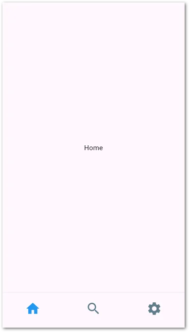
And it looks like this
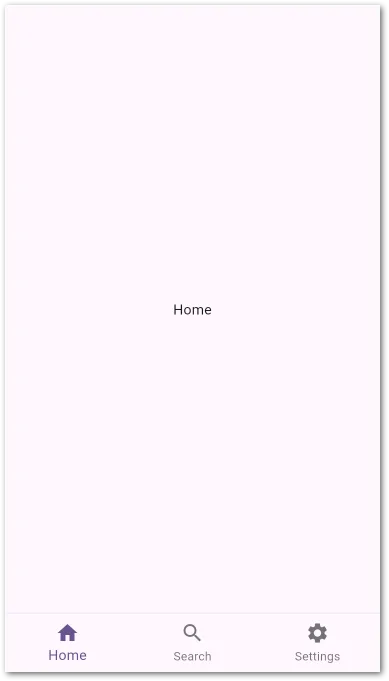
You can already see that the selected item is slightly bigger than the others. Let’s start changing the style.
Change item colors
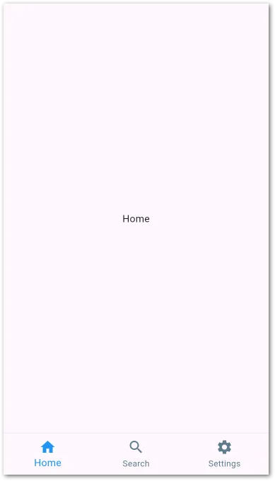
First, we start changing the colors. By default, the primary color is used to highlight the selected entry. To set another color try this
@override
Widget build(BuildContext context) {
return MaterialApp(
title: 'Flutter Demo',
debugShowCheckedModeBanner: false,
theme: ThemeData(
colorScheme: ColorScheme.fromSeed(
seedColor: Colors.deepPurple,
),
bottomNavigationBarTheme: BottomNavigationBarThemeData(
selectedItemColor: Colors.blue,
unselectedItemColor: Colors.blueGrey,
),
),
home: const MainPage(),
);
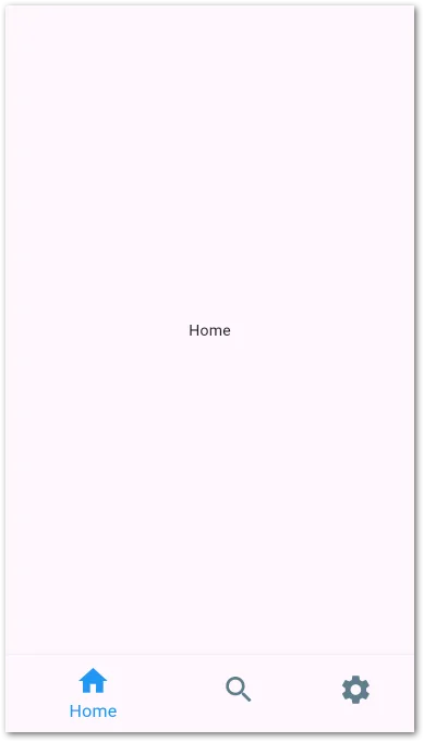
}You can either set the colors for the entire items or use selectedIconTheme/ unselectedIconTheme and selectedLabelStyle/unselectedLabelStyle to have even more control.
Make items have the same size
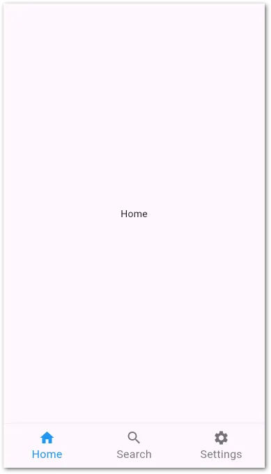
Let’s make all icons and texts always have the same size.
@override
Widget build(BuildContext context) {
return MaterialApp(
title: 'Flutter Demo',
debugShowCheckedModeBanner: false,
theme: ThemeData(
colorScheme: ColorScheme.fromSeed(
seedColor: Colors.deepPurple,
),
bottomNavigationBarTheme: BottomNavigationBarThemeData(
selectedItemColor: Colors.blue,
unselectedItemColor: Colors.blueGrey,
selectedLabelStyle: TextStyle(fontSize: 16),
unselectedLabelStyle: TextStyle(fontSize: 16),
selectedIconTheme: IconThemeData(size: 24),
unselectedIconTheme: IconThemeData(size: 24),
),
),
home: const MainPage(),
);
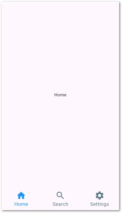
}In the app, all texts and icons have the same size now. It doesn’t matter if an entry is selected or not.
Hide labels
You can also hide the labels and make the icons bigger. Try this
@override
Widget build(BuildContext context) {
  return MaterialApp(
    title: 'Flutter Demo',
    debugShowCheckedModeBanner: false,
    theme: ThemeData(
      colorScheme: ColorScheme.fromSeed(seedColor: Colors.deepPurple),
      bottomNavigationBarTheme: BottomNavigationBarThemeData(
        selectedItemColor: Colors.blue,
        unselectedItemColor: Colors.blueGrey,
        selectedLabelStyle: TextStyle(fontSize: 16),
        unselectedLabelStyle: TextStyle(fontSize: 16),
        selectedIconTheme: IconThemeData(size: 32),
        unselectedIconTheme: IconThemeData(size: 32),
        showSelectedLabels: false,
        showUnselectedLabels: false,
      ),
    ),
    home: const MainPage(),
  );
}
Possible, but I personally don’t prefer this approach. Icons only are usually not that good to identify the purpose of an item.
Highlight the selected item
By default, the selected item was a bit larger than the others. But there is another option: BottomNavigationBarType. Here is how it works:
@override
Widget build(BuildContext context) {
  return MaterialApp(
    title: 'Flutter Demo',
    debugShowCheckedModeBanner: false,
    theme: ThemeData(
      colorScheme: ColorScheme.fromSeed(seedColor: Colors.deepPurple),
      bottomNavigationBarTheme: BottomNavigationBarThemeData(
        selectedItemColor: Colors.blue,
        unselectedItemColor: Colors.blueGrey,
        selectedLabelStyle: TextStyle(fontSize: 16),
        unselectedLabelStyle: TextStyle(fontSize: 16),
        selectedIconTheme: IconThemeData(size: 32),
        unselectedIconTheme: IconThemeData(size: 32),
        type: BottomNavigationBarType.shifting,
      ),
    ),
    home: const MainPage(),
  );
}
The default value is fixed. When set to shifting, the selected item grabs a little more space than the other and the label is automatically hidden if you don’t explicitly set showUnselectedLabels to true.
Here is how it looks. I personally don’t like it that way.
Change elevation
Did you notice the fine line above the navigation bar?
It’s there because the widget is elevated. You can increase the value to make the gradient (it’s not a line but rather a gradient) larger or set it to 0 to have a clean area.
@override
Widget build(BuildContext context) {
return MaterialApp(
title: 'Flutter Demo',
debugShowCheckedModeBanner: false,
theme: ThemeData(
colorScheme: ColorScheme.fromSeed(seedColor: Colors.deepPurple),
bottomNavigationBarTheme: BottomNavigationBarThemeData(
selectedItemColor: Colors.blue,
unselectedItemColor: Colors.blueGrey,
selectedLabelStyle: TextStyle(fontSize: 16),
unselectedLabelStyle: TextStyle(fontSize: 16),
selectedIconTheme: IconThemeData(size: 32),
unselectedIconTheme: IconThemeData(size: 32),
elevation: 0
),
),
home: const MainPage(),
);
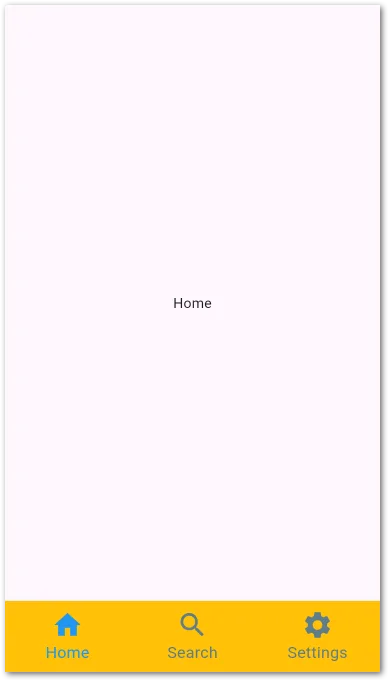
}It depends on what you like more!
Change background color
Of course, you can change the background color if you like. Have a look:
@override
Widget build(BuildContext context) {
  return MaterialApp(
    title: 'Flutter Demo',
    debugShowCheckedModeBanner: false,
    theme: ThemeData(
      colorScheme: ColorScheme.fromSeed(seedColor: Colors.deepPurple),
      bottomNavigationBarTheme: BottomNavigationBarThemeData(
        selectedItemColor: Colors.blue,
        unselectedItemColor: Colors.blueGrey,
        selectedLabelStyle: TextStyle(fontSize: 16),
        unselectedLabelStyle: TextStyle(fontSize: 16),
        selectedIconTheme: IconThemeData(size: 32),
        unselectedIconTheme: IconThemeData(size: 32),
        elevation: 0
        backgroundColor: Colors.amber
      ),
    ),
    home: const MainPage(),
  );
}
💡 Tip
Note that this does not work if the type is set to shifting! The color is then ignored.
Testing
When writing widget tests for your app, be aware that you cannot find the type BottomNavigationBarItem. Here is an example:
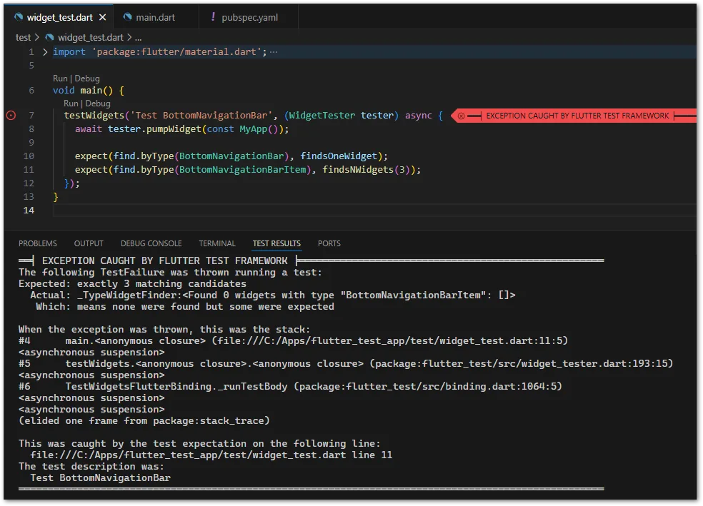
As a workaround, you can check for the labels with find.text or icons with find.byIcon of your entries. Another approach is to assign a Key to every item and check for the key with find.byKey.
Conclusion
These are the basics about how to use BottomNavigationBar in Flutter apps. Testing is a bit tricky but apart from that, it’s an easy to use and common widget in mobile apps.
Related articles
