
Introduction
In software projects, there is usually a project vision of what the end product should look like. When a developer starts working, there should be some kind of mockup (best case is a Figma file, but I have also seen pencil drawings…). In this article, I want to share my strategies of how to cut a design mockup into Flutter widgets.
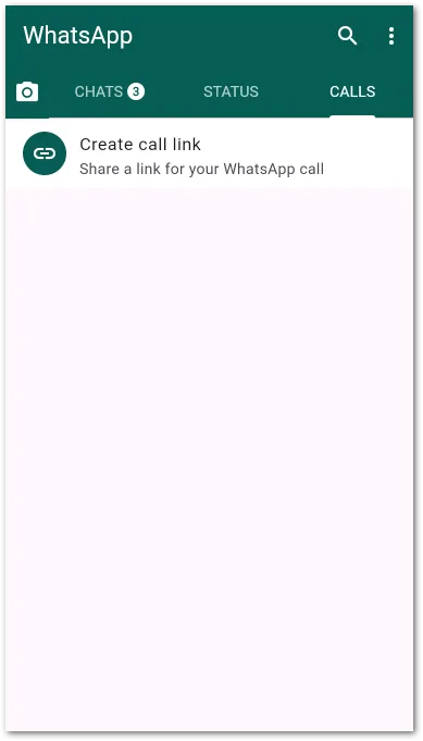
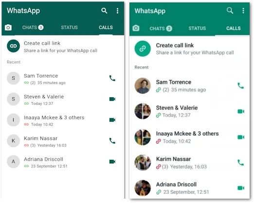
To illustrate the process, let’s assume we have this template:
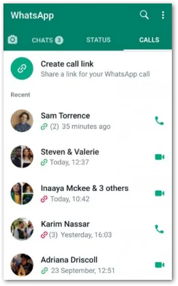
This is an old screenshot of the messenger app WhatsApp. We are going to analyze it, slice it into chunks, and find Flutter widgets to implement it. We don’t care about the full functionality like calling or sending messages. The UI is the only part that is interesting to us.
Available widgets
I always recommend starting with the base Flutter widgets. They are well-tested and have proven their reliability. Starting from that base, we build tailored widgets for our use cases.
Sometimes, it makes sense to check the official package repository pub.dev for alternatives to save time. But be cautious not to just use any widget because the repository is full of packages that only serve a specific purpose while having limitations in other areas. Regular updates, high download numbers, and active development are indicators for a solid candidate.
From top to bottom
I always go from top to bottom.
Why?
Because that is the natural reading behavior of people. Of course, you can start from the bottom with your analysis, but it doesn’t feel natural to me.
The same rule applies for the horizontal direction: I go from left to right. But there is no harm in doing right to left. Totally fine and works with the same principles.
Choose what you like best!
To follow along with this article about how to cut a design mockup into Flutter widgets, remember that we use a top-to-bottom and left-to-right structure.
The app bar
At the top of practically every major app, there is an AppBar. It usually contains the title and several actions like searching or opening a menu.
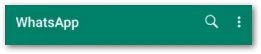
In our example, we have a title on the left and search and menu buttons on the right.
Here is how you could do this in a Flutter app:
Scaffold(
backgroundColor: Colors.white,
appBar: AppBar(
backgroundColor: Color(0xFF075E54),
title: Text('WhatsApp', style: TextStyle(color: Colors.white)),
actions: [
IconButton(
icon: Icon(Icons.search),
onPressed: () {
// TODO: Implement search
},
),
IconButton(
icon: Icon(Icons.more_vert),
onPressed: () {
// TODO: Implement menu
},
),
],
)
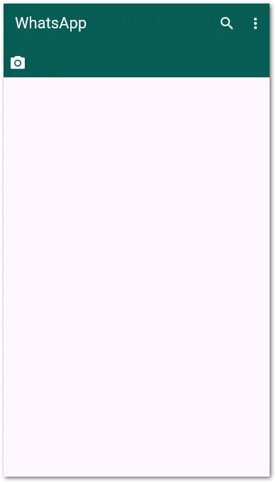
)The code sets the title, adjusts some colors, and creates the actions as tappable IconButtons. The Scaffold acts as a container and makes it easy to create views.
If you add a Drawer widget to the Scaffold, the framework automatically adds it to the AppBar (but with a different icon).
Since these are only screenshots, setting the correct margins, paddings, font faces, and sizes is tricky. When you have a proper Figma design, you can create pixel-perfect UIs based on that. For the sake of this example, we skip this step.
This is how the app can look like after adding the AppBar:
The tab bar
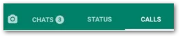
Next, we focus on the TabBar section. A lot is going on here.
On the left, we have a camera icon button. Next to that, there is the TabBar widget with three headers and an optional unread notification count indicator.
Create a Row
To make this work, we can use a Row widget that contains the IconButton and the TabBar inside. A Row aligns widgets in a horizontal direction next to each other. The counterpart is a Column that does the same in a vertical direction.
Here is how you could create the Row:
Scaffold(
  backgroundColor: Colors.white,
  appBar: AppBar(
    backgroundColor: Color(0xFF075E54),
    title: Text('WhatsApp', style: TextStyle(color: Colors.white)),
    actions: [
      IconButton(
        icon: Icon(Icons.search, color: Colors.white),
        onPressed: () {
          // TODO: Implement search
        },
      ),
      IconButton(
        icon: Icon(Icons.more_vert, color: Colors.white),
        onPressed: () {
          // TODO: Implement menu
        },
      ),
    ],
    bottom: PreferredSize(
      preferredSize: Size.fromHeight(48),
      child: Container(
        color: Color(0xFF075E54),
        child: Row(
          children: [
            IconButton(
              icon: Icon(Icons.camera_alt, color: Colors.white),
              onPressed: () {
                // TODO: Implement camera
              },
            ),
            Expanded(
              child: Container(), // TODO: Add TabBar
            ),
          ],
        ),
      ),
    ),
  );
The bottom property is useful when you want to place widgets underneath the AppBar. It expects a PreferredSize widget to determine the height. You cannot set the height in the Container and skip the PreferredSize widget. This leads to a runtime exception.
The Expanded widget in the Row is needed because the Container doesn’t specify a width. The framework wouldn’t know how to arrange the children. With the Expanded, we tell it to give the child the maximum space available. This is also quite useful in responsive designs.
Here is the current result:
Create a TabBar
The next step is to remove the placeholder and insert a TabBar widget. A TabBar uses a TabController, Tabs inside the TabBar, and a TabBarView. A Tab is the clickable header, a TabBarView shows the content of a Tab, and a TabBarController connects the elements and handles clicks and animations.
In addition, we use the Badge widget to display the unread notification count next to the title. To align text and counter horizontally, we use the Row widget once again.
To learn more about the Badge widget, I recommend my article below:

Here is the full code:
DefaultTabController(
  initialIndex: 2,
  length: 3,
  child: Scaffold(
    backgroundColor: Colors.white,
    appBar: AppBar(
      backgroundColor: Color(0xFF075E54),
      title: Text(
        'WhatsApp',
        style: TextStyle(color: Colors.white),
      ),
      actions: [
        IconButton(
          icon: Icon(Icons.search, color: Colors.white),
          onPressed: () {
            // TODO: Implement search
          },
        ),
        IconButton(
          icon: Icon(Icons.more_vert, color: Colors.white),
          onPressed: () {
            // TODO: Implement menu
          },
        ),
      ],
      bottom: PreferredSize(
        preferredSize: Size.fromHeight(48),
        child: Container(
          color: Color(0xFF075E54),
          child: Row(
            children: [
              IconButton(
                icon: Icon(Icons.camera_alt, color: Colors.white),
                onPressed: () {
                  // TODO: Implement camera
                },
              ),
              Expanded(
                child: TabBar(
                  indicatorColor: Colors.white,
                  labelColor: Colors.white,
                  unselectedLabelColor: Colors.white70,
                  tabs: [
                    Tab(
                      child: Row(
                        mainAxisSize: MainAxisSize.min,
                        spacing: 4,
                        children: [
                          Text('CHATS'),
                          Badge(
                            backgroundColor: Colors.white,
                            label: Text(
                              '3',
                              style: TextStyle(
                                color: Color(0xFF075E54),
                                fontSize: 11,
                                fontWeight: FontWeight.bold,
                              ),
                            ),
                          ),
                        ],
                      ),
                    ),
                    Tab(text: 'STATUS'),
                    Tab(text: 'CALLS'),
                  ],
                ),
              ),
            ],
          ),
        ),
      ),
    ),
    body: TabBarView(
      children: [
        Center(child: Text('Chats')),
        Center(child: Text('Status')),
        Center(child: Text('Calls')),
      ],
    ),
  ),
);
The entire Scaffold is wrapped in a DefaultTabController. Its length property is set to 3. This means we need 3 Tabs and 3 TabViews. A runtime error occurs if there are too many or too few items.
Inside the first Tab, there is the mentioned Row for the title and the counter. Notice the spacing property here. The value is added as horizontal spacing between all children inside the Row. A Column works the same way.
Let’s have a look at the latest app update:
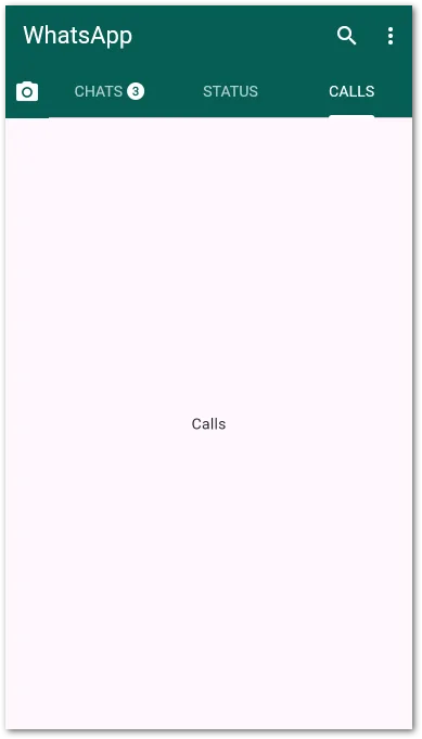
Looks quite good already!
We are nearly halfway through this article on how to cut a design mockup into Flutter widgets. Let’s continue with the call list.
The sticky call link
The sticky call link looks like a list item, but doesn’t scroll. It always stays at the top when scrolling the call list. To make this work, we simply put this widget on top of the call list table.
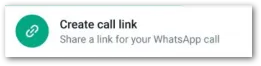
The best widget for the job is the ListTile. It’s very flexible, can show text in two rows, and supports leading and trailing icons.
Check out the next code step:
DefaultTabController(
  initialIndex: 2,
  length: 3,
  child: Scaffold(
    backgroundColor: Colors.white,
    appBar: AppBar(
      backgroundColor: Color(0xFF075E54),
      title: Text('WhatsApp', style: TextStyle(color: Colors.white)),
      actions: [
        IconButton(
          icon: Icon(Icons.search, color: Colors.white),
          onPressed: () {
            // TODO: Implement search functionality
          },
        ),
        IconButton(
          icon: Icon(Icons.more_vert, color: Colors.white),
          onPressed: () {
            // TODO: Implement menu
          },
        ),
      ],
      bottom: PreferredSize(
        preferredSize: Size.fromHeight(48),
        child: Container(
          color: Color(0xFF075E54),
          child: Row(
            children: [
              IconButton(
                icon: Icon(Icons.camera_alt, color: Colors.white),
                onPressed: () {
                  // TODO: Implement camera
                },
              ),
              Expanded(
                child: TabBar(
                  indicatorColor: Colors.white,
                  labelColor: Colors.white,
                  unselectedLabelColor: Colors.white70,
                  tabs: [
                    Tab(
                      child: Row(
                        mainAxisSize: MainAxisSize.min,
                        children: [
                          Text('CHATS'),
                          SizedBox(width: 4),
                          Badge(
                            backgroundColor: Colors.white,
                            label: Text(
                              '3',
                              style: TextStyle(
                                color: Color(0xFF075E54),
                                fontSize: 11,
                                fontWeight: FontWeight.bold,
                              ),
                            ),
                          ),
                        ],
                      ),
                    ),
                    Tab(text: 'STATUS'),
                    Tab(text: 'CALLS'),
                  ],
                ),
              ),
            ],
          ),
        ),
      ),
    ),
    body: TabBarView(
      children: [
        Center(child: Text('Chats')),
        Center(child: Text('Status')),
        Center(
          child: Column(
            children: [
              ListTile(
                tileColor: Colors.white,
                leading: CircleAvatar(
                  backgroundColor: Color(0xFF075E54),
                  child: Icon(Icons.link, color: Colors.white),
                ),
                title: Text('Create call link'),
                subtitle: Text('Share a link for your WhatsApp call'),
              ),
            ],
          ),
        ),
      ],
    ),
  ),
);
The 3rd TabBarView has changed. It now contains a Column with a ListTile inside (and a list in the next step). The icon does not match 100% because WhatsApp doesn’t use the Material Design Icons provided by the Flutter framework. We also didn’t implement a onTap event. So, nothing happens when you tap the link.
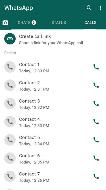
Here is a quick update of our progress:
It’s getting real!
The call list
After the sticky call link, we can focus on the call list.
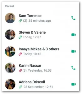
There is a group header above the list. The question now is: Is this header sticky or does it scroll with the list?
When it should always stay at the same position, we can do the same as with the sticky call link:
// DefaultTabController, Scaffold, AppBar, ... omitted

TabBarView(
  children: [
    Center(child: Text('Chats')),
    Center(child: Text('Status')),
    Center(
      child: Column(
        children: [
          // Sticky Create Call Link tile
          Container(
            color: Colors.white,
            child: ListTile(
              leading: CircleAvatar(
                backgroundColor: Color(0xFF075E54),
                child: Icon(Icons.link, color: Colors.white),
              ),
              title: Text('Create call link'),
              subtitle: Text('Share a link for your WhatsApp call'),
            ),
          ),

          // Section header: "Recent"
          Container(
            alignment: Alignment.centerLeft,
            padding: EdgeInsets.symmetric(horizontal: 16, vertical: 8),
            child: Text(
              'Recent',
              style: TextStyle(
                fontSize: 13,
                color: Colors.grey[600],
                fontWeight: FontWeight.w500,
              ),
            ),
          ),

          // Scrollable list of dummy entries
          Expanded(
            child: ListView.builder(
              itemCount: 20,
              itemBuilder: (context, index) {
                return SizedBox(
                  height: 40,
                  child: Text("Contact $index"),
                );
              },
            ),
          ),
        ],
      ),
    ),
  ],
);
There is now another Container underneath the sticky call link to display the group header. It is outside of the ListView (we’ll deal with the list entries in the next chapter), so it doesn’t scroll.

To make the header scroll with the list, it needs to be inside the ListView. We can do this with a little trick because ListView doesn’t support grouped lists.
// DefaultTabController, Scaffold, AppBar, ... omitted

TabBarView(
  children: [
    Center(child: Text('Chats')),
    Center(child: Text('Status')),
    Center(
      child: Column(
        children: [
          // Sticky Create Call Link tile
          Container(
            color: Colors.white,
            child: ListTile(
              leading: CircleAvatar(
                backgroundColor: Color(0xFF075E54),
                child: Icon(Icons.link, color: Colors.white),
              ),
              title: Text('Create call link'),
              subtitle: Text('Share a link for your WhatsApp call'),
            ),
          ),

          // Scrollable list including the "Recent" header
          Expanded(
            child: ListView.builder(
              itemCount: 21, // 1 for the header + 20 entries
              itemBuilder: (context, index) {
                if (index == 0) {
                  // Group header inside the scroll
                  return Container(
                    alignment: Alignment.centerLeft,
                    padding: EdgeInsets.symmetric(
                      horizontal: 16,
                      vertical: 8,
                    ),
                    child: Text(
                      'Recent',
                      style: TextStyle(
                        fontSize: 13,
                        color: Colors.grey[600],
                        fontWeight: FontWeight.w500,
                      ),
                    ),
                  );
                }

                // Call entries
                final contactIndex = index - 1;
                return SizedBox(
                  height: 40,
                  child: Text("Contact  $contactIndex"),
                );
              },
            ),
          ),
        ],
      ),
    ),
  ],
);
We add the group header as the first entry by checking the index argument. When it’s zero, we show the header. Otherwise, we show the call entries.
The package grouped_list is a popular alternative that supports grouped lists. You can always fall back to the package repository when the built-in widgets don’t suit your needs.
The call list entry
The last step is to design a single call list entry.
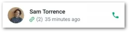
To do this, we once again rely on the ListTile widget that we used before. Image on the left, two rows of text, and an action icon on the right. The lower text row is a bit more complex. It contains an icon, a number, and a relative timestamp. But there is nothing we can’t deal with.
ListTile(
  leading: CircleAvatar(
    backgroundColor: Colors.grey[300],
    child: Text(
      'S',
      style: TextStyle(color: Colors.black),
    ),
  ),
  title: Text('Sam Torrence'),
  subtitle: Row(
    children: [
      Icon(Icons.link, color: Colors.green, size: 16),
      SizedBox(width: 4),
      Text('(2)', style: TextStyle(fontSize: 12)),
      SizedBox(width: 6),
      Text(
        '35 minutes ago',
        style: TextStyle(fontSize: 12),
      ),
    ],
  ),
  trailing: Icon(Icons.call, color: Color(0xFF075E54)),
);
Nothing special here, just filling a ListTile with data. Everything is hardcoded in the first step. We first want to make it work and improve later.
Here is the final code for the entire view:
DefaultTabController(
  initialIndex: 2,
  length: 3,
  child: Scaffold(
    backgroundColor: Colors.white,
    appBar: AppBar(
      backgroundColor: Color(0xFF075E54),
      title: Text('WhatsApp', style: TextStyle(color: Colors.white)),
      actions: [
        IconButton(
          icon: Icon(Icons.search, color: Colors.white),
          onPressed: () {
            // TODO: Implement search functionality
          },
        ),
        IconButton(
          icon: Icon(Icons.more_vert, color: Colors.white),
          onPressed: () {
            // TODO: Implement menu
          },
        ),
      ],
      bottom: PreferredSize(
        preferredSize: Size.fromHeight(48),
        child: Container(
          color: Color(0xFF075E54),
          child: Row(
            children: [
              IconButton(
                icon: Icon(Icons.camera_alt, color: Colors.white),
                onPressed: () {
                  // TODO: Implement camera
                },
              ),
              Expanded(
                child: TabBar(
                  indicatorColor: Colors.white,
                  labelColor: Colors.white,
                  unselectedLabelColor: Colors.white70,
                  tabs: [
                    Tab(
                      child: Row(
                        mainAxisSize: MainAxisSize.min,
                        children: [
                          Text('CHATS'),
                          SizedBox(width: 4),
                          Badge(
                            backgroundColor: Colors.white,
                            label: Text(
                              '3',
                              style: TextStyle(
                                color: Color(0xFF075E54),
                                fontSize: 11,
                                fontWeight: FontWeight.bold,
                              ),
                            ),
                          ),
                        ],
                      ),
                    ),
                    Tab(text: 'STATUS'),
                    Tab(text: 'CALLS'),
                  ],
                ),
              ),
            ],
          ),
        ),
      ),
    ),
    body: TabBarView(
      children: [
        Center(child: Text('Chats')),
        Center(child: Text('Status')),
        Center(
          child: Column(
            children: [
              // Sticky Create Call Link tile
              Container(
                color: Colors.white,
                child: ListTile(
                  leading: CircleAvatar(
                    backgroundColor: Color(0xFF075E54),
                    child: Icon(Icons.link, color: Colors.white),
                  ),
                  title: Text('Create call link'),
                  subtitle: Text('Share a link for your WhatsApp call'),
                ),
              ),

              // Sticky "Recent" header
              Container(
                alignment: Alignment.centerLeft,
                padding: EdgeInsets.symmetric(horizontal: 16, vertical: 8),
                child: Text(
                  'Recent',
                  style: TextStyle(
                    fontSize: 13,
                    color: Colors.grey[600],
                    fontWeight: FontWeight.w500,
                  ),
                ),
              ),

              // Scrollable list of calls
              Expanded(
                child: ListView(
                  children: [
                    // Sam Torrence
                    ListTile(
                      leading: CircleAvatar(
                        backgroundColor: Colors.grey[300],
                        child: Text(
                          'S',
                          style: TextStyle(color: Colors.black),
                        ),
                      ),
                      title: Text('Sam Torrence'),
                      subtitle: Row(
                        children: [
                          Icon(Icons.link, color: Colors.green, size: 16),
                          SizedBox(width: 4),
                          Text('(2)', style: TextStyle(fontSize: 12)),
                          SizedBox(width: 6),
                          Text(
                            '35 minutes ago',
                            style: TextStyle(fontSize: 12),
                          ),
                        ],
                      ),
                      trailing: Icon(Icons.call, color: Color(0xFF075E54)),
                    ),

                    // Steven & Valerie
                    ListTile(
                      leading: CircleAvatar(
                        backgroundColor: Colors.grey[300],
                        child: Text(
                          'S',
                          style: TextStyle(color: Colors.black),
                        ),
                      ),
                      title: Text('Steven & Valerie'),
                      subtitle: Row(
                        children: [
                          Icon(Icons.link, color: Colors.green, size: 16),
                          SizedBox(width: 6),
                          Text(
                            'Today 12:37',
                            style: TextStyle(fontSize: 12),
                          ),
                        ],
                      ),
                      trailing: Icon(
                        Icons.videocam,
                        color: Color(0xFF075E54),
                      ),
                    ),

                    // Inaaya Mckee & 3 others
                    ListTile(
                      leading: CircleAvatar(
                        backgroundColor: Colors.grey[300],
                        child: Text(
                          'I',
                          style: TextStyle(color: Colors.black),
                        ),
                      ),
                      title: Text('Inaaya Mckee & 3 others'),
                      subtitle: Row(
                        children: [
                          Icon(Icons.link, color: Colors.red, size: 16),
                          SizedBox(width: 6),
                          Text(
                            'Today 10:42',
                            style: TextStyle(fontSize: 12),
                          ),
                        ],
                      ),
                      trailing: Icon(
                        Icons.videocam,
                        color: Color(0xFF075E54),
                      ),
                    ),

                    // Karim Nassar
                    ListTile(
                      leading: CircleAvatar(
                        backgroundColor: Colors.grey[300],
                        child: Text(
                          'K',
                          style: TextStyle(color: Colors.black),
                        ),
                      ),
                      title: Text('Karim Nassar'),
                      subtitle: Row(
                        children: [
                          Icon(Icons.link, color: Colors.red, size: 16),
                          SizedBox(width: 4),
                          Text('(3)', style: TextStyle(fontSize: 12)),
                          SizedBox(width: 6),
                          Text(
                            'Yesterday 16:03',
                            style: TextStyle(fontSize: 12),
                          ),
                        ],
                      ),
                      trailing: Icon(Icons.call, color: Color(0xFF075E54)),
                    ),

                    // Adriana Driscoll
                    ListTile(
                      leading: CircleAvatar(
                        backgroundColor: Colors.grey[300],
                        child: Text(
                          'A',
                          style: TextStyle(color: Colors.black),
                        ),
                      ),
                      title: Text('Adriana Driscoll'),
                      subtitle: Row(
                        children: [
                          Icon(Icons.link, color: Colors.green, size: 16),
                          SizedBox(width: 6),
                          Text(
                            '23 September 12:51',
                            style: TextStyle(fontSize: 12),
                          ),
                        ],
                      ),
                      trailing: Icon(
                        Icons.videocam,
                        color: Color(0xFF075E54),
                      ),
                    ),
                  ],
                ),
              ),
            ],
          ),
        ),
      ],
    ),
  ),
);
And here is what the result looks like:
As you can see, it’s not perfect yet. But I hope you now have a better understanding of how to cut a design mockup into Flutter widgets from this article.
Next steps
You have successfully built a user interface according to a mockup. But what to do next?
There are several optimization steps that you can take.
- Your code is probably one huge widget. Make it smaller! Extract parts in other reusable widgets and reference them.
- The code contains a lot of theme information. An improvement would be to use a ThemeData class in your MaterialApp widget and put all style information there (fonts, colors, margins, paddings, …).
- For multi-language apps, consider localizing your hardcoded strings.
- Make fixed values dynamic. For example, the counter value is currently fixed. Find a way to get the value at runtime.
- Introduce constants for reused values like
fontSizeLargeorgapXS. - And don’t forget to write tests for your widget!
All of this is an iterative process. First, you recreate the mockup and then you refactor. When you are more experienced, you’ll probably already include some optimizations during the creation process.
Conclusion
In this article, I shared my strategies of how to cut a design mockup into Flutter widgets. My strategy involves going from top to bottom and identifying basic Flutter widgets that the framework already provides. I then customize them to match the template. If you struggle with this, then maybe it’s an option to talk to the UX designer to revisit the mockup for easier implementation.
Related articles