
Introduction
Let’s explore the .NET MAUI Shell Control in depth and how you can handle it in your .NET MAUI app. Follow these examples to get started.
In this article, we are going to explore the .NET MAUI Shell Control in depth. The Shell control is the root object of every .NET MAUI application. It provides fundamental features that many apps require, including:
- A single place to describe the visual hierarchy of an app.
- A common navigation user experience.
- A URI-based navigation scheme that permits navigation to any page in the app.
- An integrated search handler.
Here are some examples to get you started.
The Shell
The Shell contains all subpages of your app. For every page in your app, a ShellContent entry is required with the ContentTemplate property pointing to your page. Of course, you can define your pages via the Content property inline, but for the sake of maintainability, you should consider creating separate files.
To navigate to other pages, you can add a Route property to the ShellContent. It is a string that tells the app where to navigate to.
Here is a code example of how to navigate from one page to another:
private async void OnCounterClicked(object sender, EventArgs e)
{
    await Shell.Current.GoToAsync("///Page 2");
}
For more details about navigation, read the official documentation.
In case you don’t want to deal with routing or your app doesn’t require it, you can use a Flyout or a TabBar that handle routing for you. I’ll show you the concepts of the two approaches in the next sections.
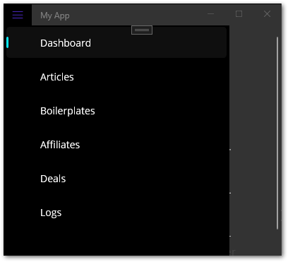
Create a Flyout menu
A Flyout menu displays all subpages in a separate menu for easy navigation. To create a Flyout, just add ShellContent entries in your XAML file and they will automatically be converted into a FlyoutItem and a containing Tab control. You can also wrap them in a FlyoutItem control and a Tab control to make it clearer, but there is no difference. To learn more about this automatic conversion, have a look at the documentation.
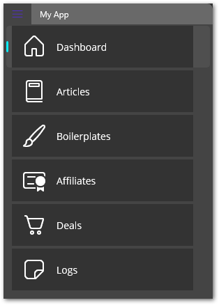
The Title property sets the header that appears by default on the page while the ContentTemplate property holds the actual page content of that menu entry.
To customize the output, we can set an ItemTemplate. Here is an example:
Here, you can see that the ShellContent entries are wrapped in FlyoutItem and Tab controls. As I said before, it doesn’t make a difference whether you do it or not. The outcome is the same.
Flyout options
The ItemTemplate uses the provided Icon and Title properties of the FlyoutItem control and aligns them horizontally next to each other. To customize the Flyout itself, look at the properties prefixed with Flyout in the Shell control. In this example, I changed the background color and width. For the icons, I use the Segoe Fluent Icons font. Since it is a font, you can assign it to a Label, and it will render as an icon. That’s what happens in this example. The colors and icons are defined in a ResourceDictionary which is merged with other resource dictionaries. You can use them in any XAML file. Here is what this dictionary looks like:
To hide a Flyout, set the property Shell.FlyoutBehavior of the Shell control to Disabled. The menu will not be visible in your app. When creating a new .NET MAUI app from the Visual Studio template, this is the default setting.
A Flyout is a simple way to allow navigation within an app. You get it by default and it takes only a few steps to make it really shiny.
🔔 Hint
Instead of using a Shell app with a Flyout menu, you can also use a FlyoutPage instead. You get more options like a swipe gesture to open the menu and more customization flexibility.
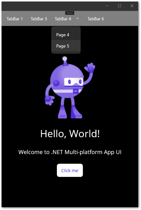
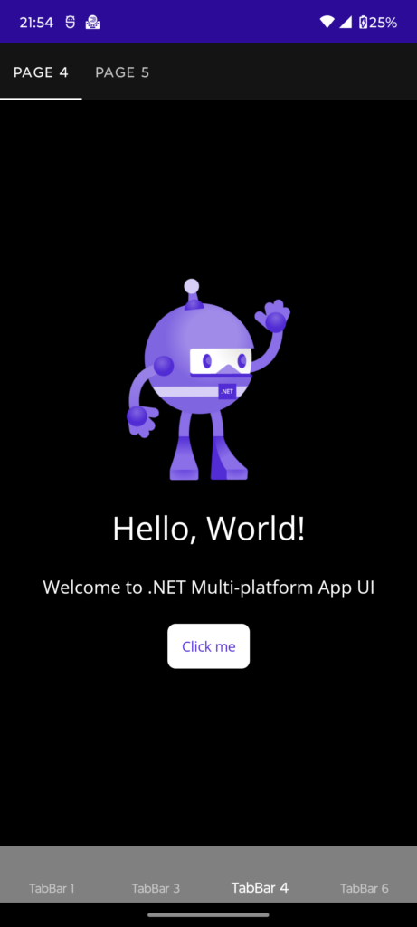
Create a TabBar menu
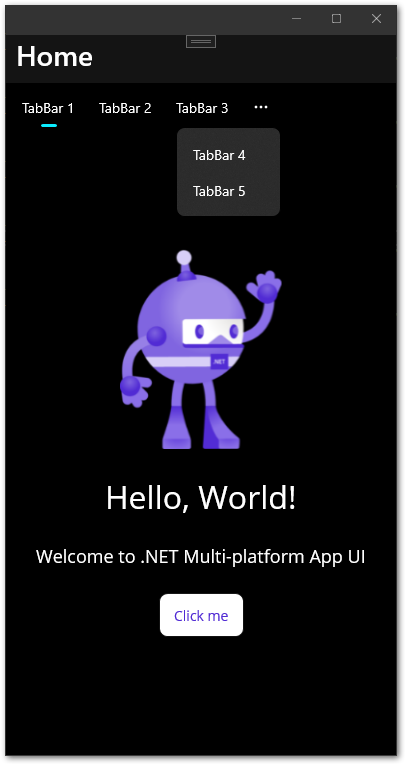
A TabBar menu aligns the items at the top or the bottom of a page. When the space isn’t enough, a … entry will automatically be created that contains the remaining items. This is usually the case on mobile devices with smaller screen sizes. Here is an example of a TabBar menu with 5 elements:
You can customize the look of the TabBar with various properties. To change the background color, use the attached property Shell.TabBarBackgroundColor. You can also set other colors like TabBarForegroundColor or hide the page title bar by setting Shell.NavBarIsVisible to false.
It is also possible to create a nested hierarchy by adding multiple ShellContent controls inside a Tab control. This will result in a drop down menu on Desktop devices and a second TabBar at the bottom or top on mobile devices.
The TabBar is a rather basic control that allows for some customization. In my opinion, I would always prefer a Flyout menu, but for a simple menu structure, it can also work.
🔔 Hint
Instead of using a Shell app with a TabBar menu, you can also use a TabbedPage instead. This approach has more customization options.
Create a custom menu or even no menu at all
This is also possible, so here are some hints.
- Set the
Shell.FlyoutBehaviortoDisabledandShell.TabBarIsVisibletofalse.
If you defineShellContent entries for your routes, disable the automatically createdFlyoutandTabBarmenus with this setting. - Consider registering routes on the go.
You can register routes inShellContent,FlyoutItem, andTabcontrols. But there is also the static classRoutingwith itsRegisterRoutemethod. You can register routes anywhere or only if needed. Consider reading the documentation for more details. - Think about using other page controls.
Using theShellis not the only approach to implement a .NET MAUI app. There are 3 other pages controls (NavigationPage, TabbedPage, FlyoutPage) that can act as a root page of an application. Each one has different pros and cons. Check them out and decide if they solve your problem.
I want a menu entry to be excluded from my Flyout/TabBar. How do I do that?
Use the IsVisible property of the corresponding item and set it to false. The entry will not appear in your menu.
I am developing a desktop app and my Flyout menu should always stay opened. How can I achieve that?
The Shell control has a property FlyoutBehavior. When set to Disabled, the Flyout menu is disabled and not shown. When set to Flyout (the default value), it can be activated via the hamburger button. And the setting Locked makes the menu stays opened all the time.
Conclusion
In this article, we explored the .NET MAUI Shell control in depth. It serves as the central starting point of your app. This article explained how to handle menu creation and navigation with the Shell. In case you have different requirements, you can also use TabbedPage, NavigationPage, or FlyoutPage as your root page. These options offer different possibilities, but in most cases, a Shell app will be sufficient.
Related articles
