
Introduction
Here is how to use the Scaffold widget in a Flutter application to create a consistent app skeleton in no time. It’s the most common basic building block in Flutter apps and here is how it works!
In Flutter, a Scaffold is a fundamental building block used to create the basic structure and layout for an app’s user interface. It provides a pre-designed app bar, a body area, and other essential components, making it easier for developers to create consistent and standard app layouts. Think of it as a template for your app’s screen with that you can start development faster.
Here is a detailed guide of how to use the Scaffold widget in a Flutter application!
body
The body is the main display area of your app and is always required. Feel free to do here whatever you want!
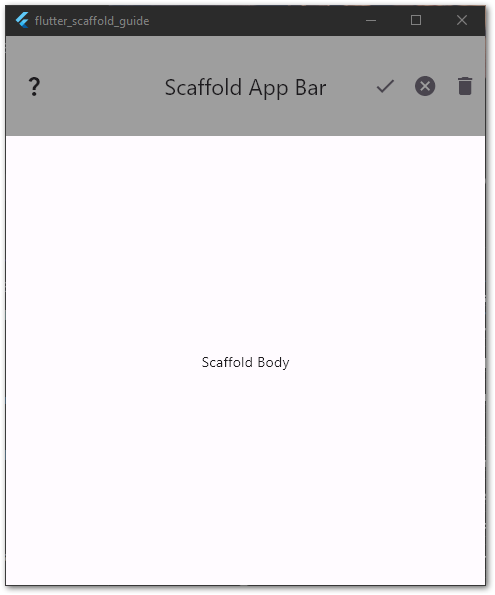
appBar
The AppBar resides at the top of the application. It’s a fixed container to show various information such as the app name, menus, or quick actions.
You can specify leading, title, and action widgets.
If the leading widget is not specified, it will be automatically populated with either a drawer icon (see next section) or a navigation arrow. To disable this behavior, set automaticallyImplyLeading to false.
The title widget usually contains the name of the app in a Text widget.
The actions section can be used to add a list of IconButton widget like save or cancel buttons.
Here is an example of an AppBar:
Want More Flutter Content?

Join my bi-weekly newsletter that delivers small Flutter portions right in your inbox. A title, an abstract, a link, and you decide if you want to dive in!
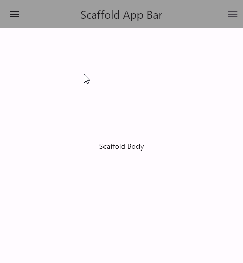
drawer/endDrawer
Drawers are menus that are invisible by default on mobiles. If you see a hamburger icon in the top left or top right corner, it’s usually a drawer menu underneath. A user can open and close them by clicking the icon. In addition, the widget supports swipe gestures to open and close the menu.
Drawers usually offer navigation options to different pages of an app. Typical examples include settings, user profile, login, or about pages.
Here is a code example for a Drawer or EndDrawer in a Scaffold:
To close a drawer programmatically, use Navigator.of(context).pop().
❗
Warning
An EndDrawer is only visible in the app bar by default if you have not set any actions!
❗
Warning
A Drawer is only visible in the app bar by default if you have not set a leading widget!
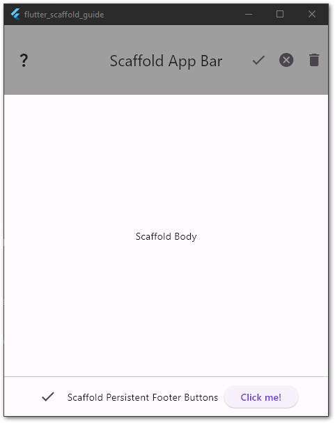
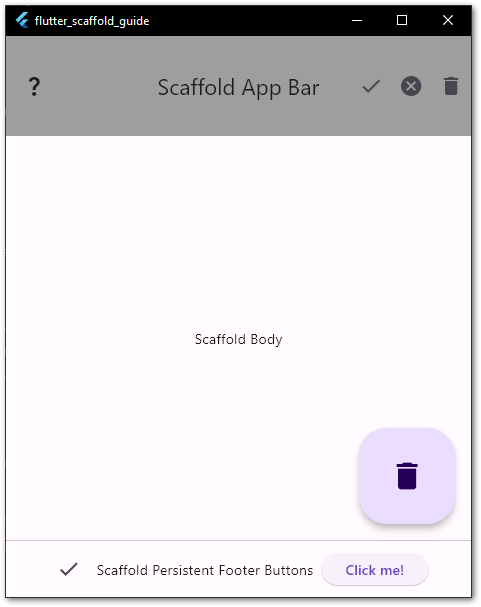
persistentFooterButtons
persistentFooterButtons accepts a list of any widgets and those widgets appear permanently at the bottom of the screen.. Although the name implies that only buttons are supported, you can put any Widget here. To change the alignment, use the property persistentFooterAlignment.
Here is a code example of how to add widgets to the bottom area:
floatingActionButton
The FloatingActionButton is a button that floats on top of the UI at the specified location. You need to specify the child and the onPressed property. Usually, the button contains only an icon for an action that users need regularly like creating new entries in a list.
There are also alternative named constructors extended, small, and large. The small and large options are identical to the default one but make the button smaller or larger. The extended constructor has the options label and icon and is used best when you want to display text and icon together.
To control the position of the button, use the floatingActionButtonLocation property. The default value is endFloat.
Here are some code examples for different FloatingActionButtons:
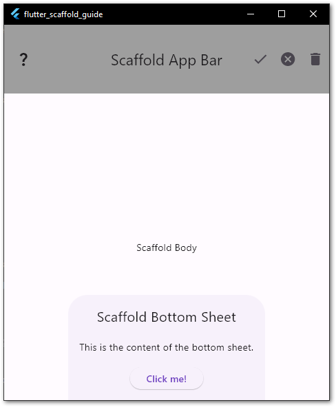
bottomSheet
The bottomSheet is used to display additional information when required. Think of it as a context menu or a dialog. You can use it in two different ways.
When you assign a widget to the bottomSheet property of a Scaffold, it is permanent. You cannot close it and it will stay on the screen. To be honest, I haven’t seen anyone using the widget in that way until now.
The second option is to use the showModalBottomSheet function to display a bottom sheet on demand. You can close it with a simple Navigator.of(context).pop().
Let’s say you have a navigation bar at the bottom and there are more options than the screen size allows. With a bottom sheet, you can display additional options when requested by the user.
Here is a code example of a persistent BottomSheet:
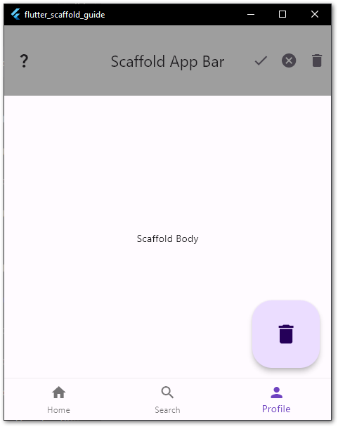
bottomNavigationBar
bottomNavigationBar is similar to persistentFooterButtons. However, the navigation bar requires a list of BottomNavigationBarItems as children with a label and an icon. There are fewer styling options available but when you want the bottom area to be used for navigation, the BottomNavigationBar is the way to go.
With the currentIndex property, you set the active child item.
Here is a code example of a BottomNavigationBar:
💡 Tip
Don’t use bottomNavigationBar and persistentFooterButtons at the same time. Choose one and stick with. If you want navigation, choose the navigation bar. Use the footer buttons for everything else!
Conclusion
In this article, you learned how to use the Scaffold widget in a Flutter application. We covered various options to customize it with an AppBar, a FloatingActionButton, a Drawer, or a BottomSheet. There are many possibilities to choose from that makes the Scaffold an ideal starting template for any Flutter app.
Related articles
