How To Create Beautiful Charts And Graphs In Your Flutter Application
Introduction Link to heading
Learn how to create beautiful charts and graphs in your Flutter application to create dashboards or visualize statistic evaluations. With this article you can get started quickly!
In this article, I’ll show you how to create beautiful charts and graphs in your Flutter application. I’ll cover the tools and methods to create good-looking and interactive charts. Whether you’re making a finance app, a data dashboard, or just want to make your app look better, learning how to make charts in Flutter can be a big help.
To create charts, I use the package fl_charts. It’s easy to set up, good to work with, and has an outstanding documentation. The following chart types are currently supported:
I will show you the PieChart and the LineChart. As they all work similar, you won’t have trouble implementing the other types yourself.
PieChart Link to heading
Let’s start with an image of what the end result can look like:
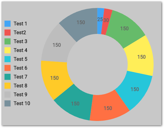
A pie chart with a legend
And here is some code. I’ll explain it in the following.
A pie chart is just a collection of sections with various settings. Every section is represented by a PieChartSectionData object. I customized title, position, size, value, color, radius, and border. So as you can easy, there are a lot of options to play around with.
The PieChart object has some neat configuration options
-
centerSpaceRadiusto change the size of the circle in the middle -
sectionsSpaceto create gaps between sections -
startDegreeOffsetto indicate where the first segment is located
Chart legends are not supported. You have to build them yourself. I just went with a Column, the section colors, and the titles. Simple and effective!
If you want to handle touches or hovers, you can use PieTouchData. There is a touchCallback function that returns the touched section of the chart. In my case, I decided to make the section a bit larger and draw a border around it when touched. Animations are already built-in, so you don’t have to deal with them!
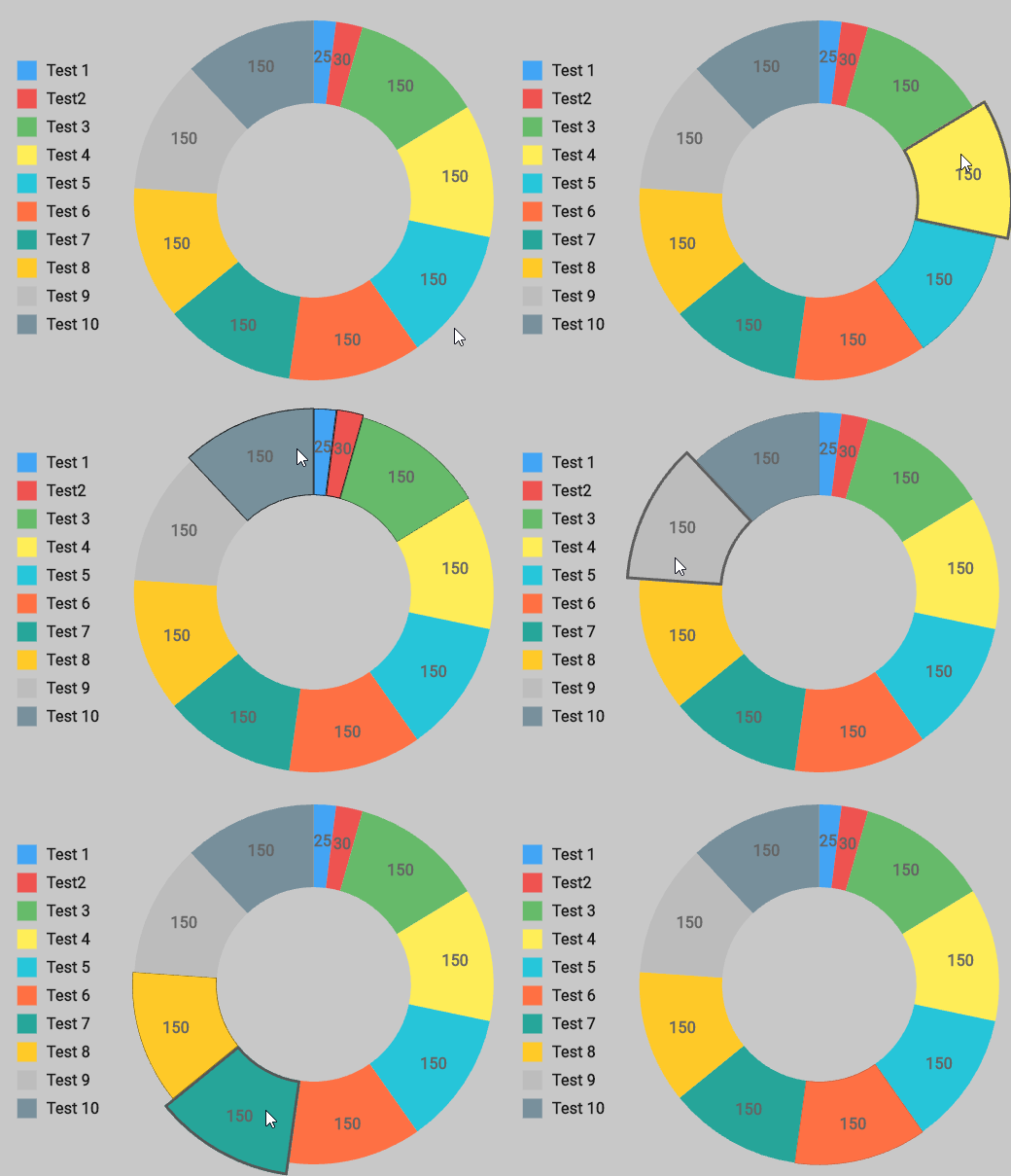
A pie chart with animated segments
Of course, there is much more to explore, but you should get the point of how to create pie charts with this package. Check out the documentation and code examples for further details.
LineChart Link to heading
Once again, let’s get some inspiration and look at an example:
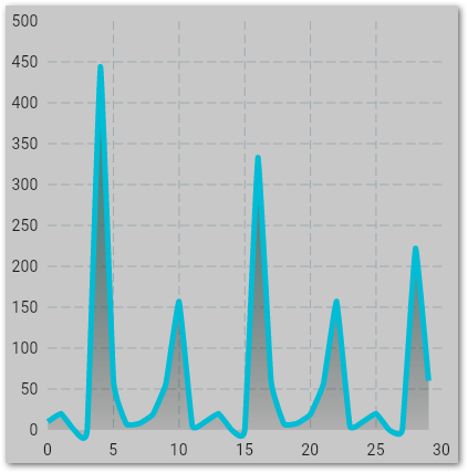
A line chart with axis descriptions
And the corresponding code to this image:
A line chart is a collection of connected two-dimensional coordinates with optional axis captions or grid lines.
The lineBarsData array contains all lines within the chart. You can draw as many as you want. The LineChartBarData class allows you to customize for example the line (isCurved, curveSmoothness, width), what happens under the line (belowBarData), or what data points the line uses (spots).
Axis scales and captions are created on all sides by default. Of course, you can customize each axes individually by overwriting the getTitlesWidget function and setting the interval of the SideTitles object of an axes. Here is a good example of how this works.
To change the grid appearance, use the FlGridData class. And if you want some interaction, read about touch handling here.
Conclusion Link to heading
In this article, you learned how to create beautiful charts and graphs in your Flutter application. The package fl_charts make it as easy as possible while also being flexible and customizable.
Related articles Link to heading

How to Implement Drag and Drop in a Flutter Application Link to heading
Here is how to implement drag and drop in a Flutter application and build awesome user interfaces for all input types.
How to add swipe to dismiss in Flutter apps for a better UX Link to heading
Here is how you can implement the swipe-to-dismiss pattern in ListViews of a Flutter applications.
How To Make A Simple Quiz Page Widget For Flutter Apps Link to heading
Challenging your users with questions is common. So here is how to make a simple quiz page widget for Flutter apps.