Introduction
Flutter offers predefined widgets for dialogs, toasts, and overlays. This article shows how you use them properly with code examples. Here is how to work with dialogs, toasts, and overlays in Flutter apps!
Dialogs are a common pattern in many applications. In this article, I’ll introduce you to the built-in possibilities of Flutter for creating dialogs. We will cover the following widget types:
▶ AlertDialog (and CupertinoAlertDialog)
▶ SimpleDialog
▶ Dialog
▶ Overlay
▶ Toast
Want More Flutter Content?

Join my bi-weekly newsletter that delivers small Flutter portions right in your inbox. A title, an abstract, a link, and you decide if you want to dive in!
AlertDialog (and CupertinoAlertDialog)
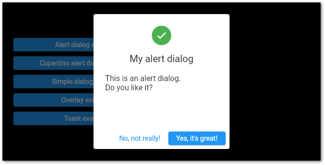
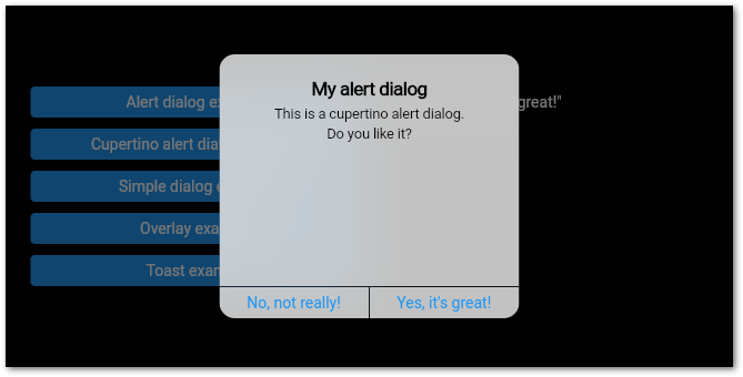
The AlertDialog is the most simple way to display information to the user that he needs to react to. It’s a simple widget with a title (heading), a content (message), and a list of actions (one or more buttons).
The AlertDialog has some additional properties compared to the CupertinoAlertDialog. There is, for example, the icon property that lets you add an icon on top of the heading.
To invoke the widget, use the showDialog function. If you don’t want that users can close the dialog by tapping anywhere outside of it, set the barrierDismissible value to false. In this case, you must take care of closing the dialog with Navigator.of(context).pop(), for example.
Here are two screenshots from the demo application of the dialogs:
SimpleDialog
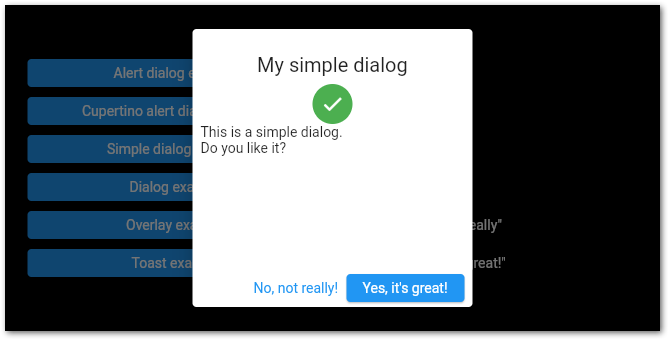
The SimpleDialog gives you more freedom to design your dialog. The basic properties are only a title and a list of children. Its main purpose is to choose from a selection of options. Instead of a button bar at the bottom, you can add multiple selection options with the SimpleDialogOption widget. Like the AlertDialog, the SimpleDialog is triggered by the showDialog() method.
Dialog
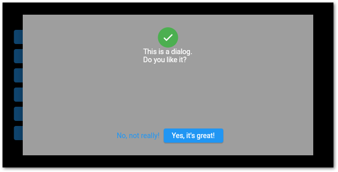
The Dialog is the purest dialog you can have. It needs only one child, so you can use your entire creativity to style it the way you want. Apart from that, it works similarly to the AlertDialog and the SimpleDialog.
Overlay
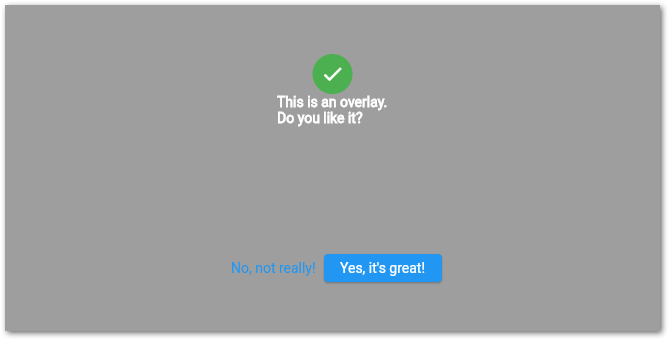
An Overlay is a widget that will be placed on top of all other widgets. You can think of it as a Stack widget, but it can be put on top of any page in your app. You need to create an OverlayEntry first that contains the widget to be displayed. To display it, call Overlay.of(context)!.insert(overlayEntry);. To remove it, call overlayEntry?.remove();.
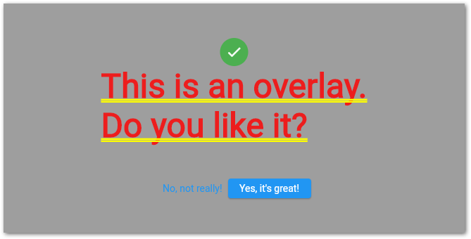
Overlays don’t use the ThemeData of Text widgets. So you need to style all Text widgets or your Overlay will look like this:
Toast
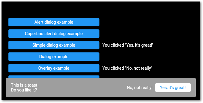
To display a toast notification, a SnackBar can be used. A SnackBar will be displayed at the bottom of your screen and will auto-hide after 4 seconds by default. You can add any widgets you want and customize various properties like dismissDirection (a swipe to the set direction will hide the widget) or duration (timespan after that the widget hides).
A SnackBar can only be used inside a Scaffold. To show a SnackBar, call the showSnackBar(…) method of the ScaffoldMessengerState. Hiding works similarly with the hideSnackBar() method.
Conclusion
In this article, you saw the differences between the different dialog widgets and how to use them. You can find the demo application with the working examples on GitHub.
Related articles
